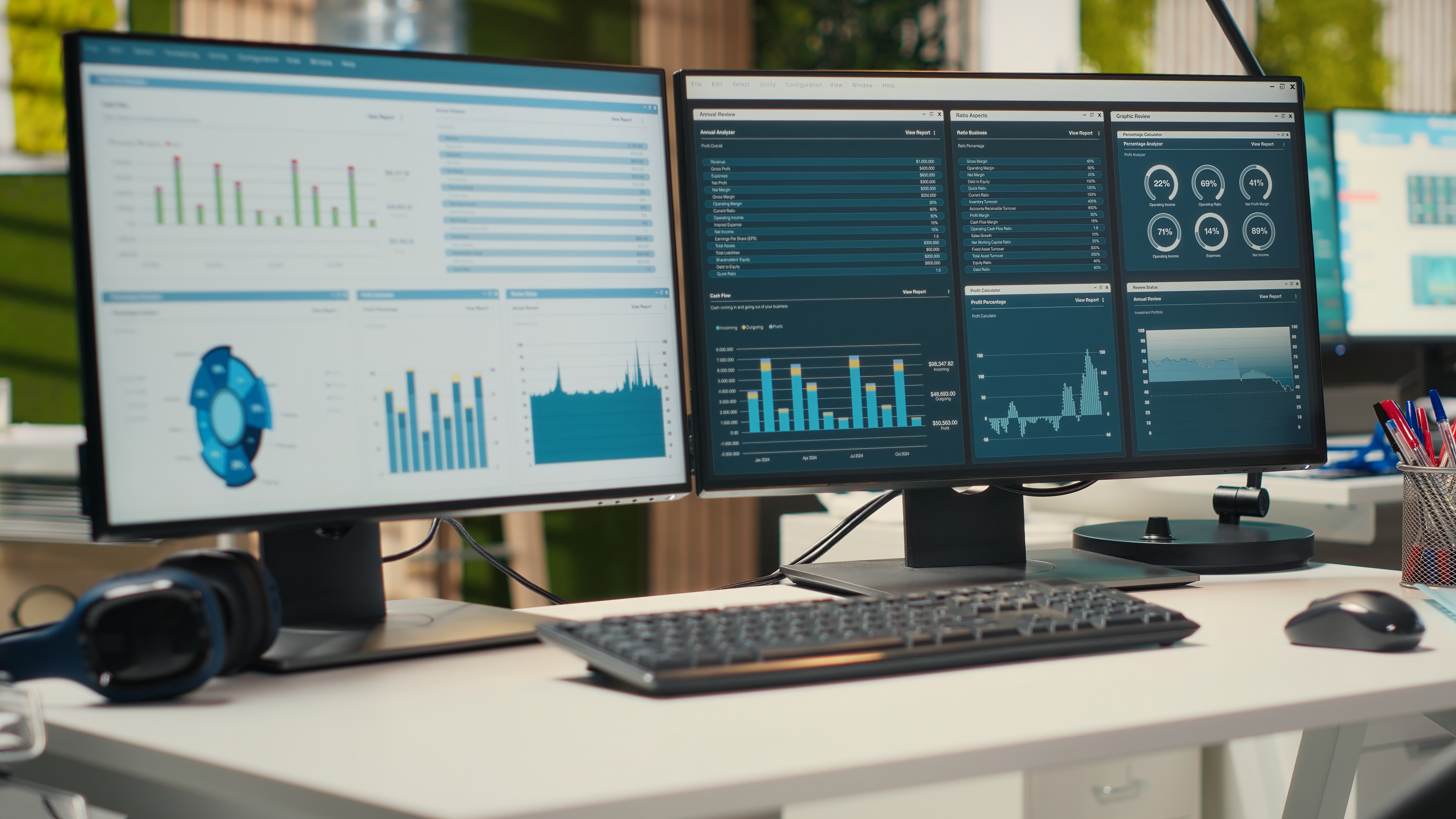
Short on time? Steal these four ideas before you open a single dashboard tool.
- Decisions first, charts second: Start with the calls you make every week, not the metrics you happen to be able to pull. A dashboard with no decision behind it is just expensive wallpaper.
- Fewer KPIs, fewer headaches: Give every dashboard one owner, one audience, and five to nine numbers that actually change behavior. If everything is critical, nothing is. Sorry, everything.
- Define it or debate it: Build a metric dictionary before the first chart, or watch finance and sales fight over the word "revenue." Every. Single. Meeting.
- Make it a habit, not a hobby: Tie the dashboard to a real meeting, then track its usage like a product. If nobody opens it, that's data too!
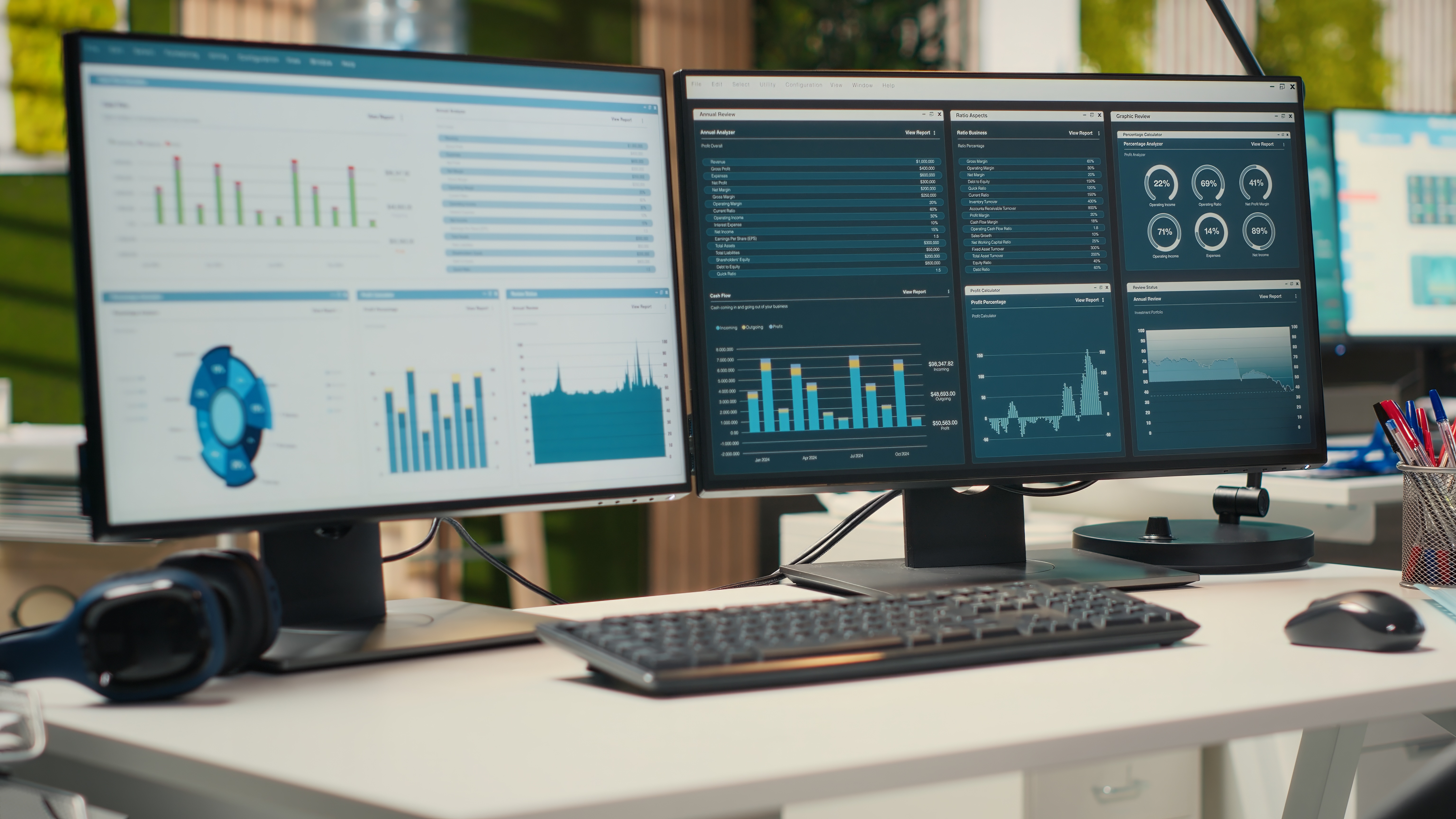
Most dashboards die before anyone questions the charts.
They die in the meeting before the build starts, when nobody agrees on which decision the dashboard is supposed to support. They die when finance defines revenue one way, sales defines it another, and operations exports a third version into a spreadsheet five minutes before the leadership call. And they die when a business intelligence dashboard looks gorgeous but forces your team to change their workflow just to read it.
Sound familiar? That's how so many growing companies end up with the same weird setup: a shiny reporting layer on top, and underneath it, Slack messages, side spreadsheets, and "quick manual checks."
If you want to know how to build a data dashboard for your business, start there. The dashboard people actually use is rarely the one with the most charts. It's the one that makes the next decision faster.
We've made this point before in our business intelligence writing. Tools matter less than whether the system is affordable, consistent, and actually used by your team. We treat dashboards as part of an operating system for growth, not a decorative reporting exercise on the side. That's also the thread running through our take on operational intelligence consulting for SMBs: owner dashboards only work when they help you run the business in real time.
Start with decisions, not metrics
A lot of teams start with a metric inventory. They list MRR, CAC, close rate, churn, utilization, gross margin, pipeline coverage, lead volume, NPS, ticket backlog, and website traffic. Then they cram all of it onto one screen.
The result? A dashboard that technically answers everything and practically answers nothing.
Five decisions worth building around
A better starting point is a short list of repeated business decisions. For a founder or operator at a growing SMB, they usually sound like this:
- Do we have enough qualified pipeline to hit next month's number?
- Which delivery bottlenecks are hurting margin this week?
- Where is cash risk building?
- Which clients, channels, or products are becoming less profitable?
- What needs intervention today, and what can wait for review?
That shift matters because dashboards aren't neutral containers. Their shape should follow your decision cycle. Microsoft's Power BI planning guidance says the same thing in enterprise terms: gather requirements from the people who will use the solution before anyone designs it.
Enterprise guidance, small-shop principle. If your team makes weekly operating decisions, build for weekly operating decisions. If your leadership team intervenes daily, real-time updates may earn a spot for a narrow set of metrics. If the business reviews certain KPIs monthly, pretending they need minute-by-minute visibility creates noise, not speed.
Define one owner, one audience, one job
The fastest way to kill adoption is to build one dashboard "for everyone."
A founder wants exception reporting. A sales manager wants rep-level drilldowns. A delivery lead wants workload risk. Finance wants clean definitions and period controls. Cram all four into one interface and everybody sees too much of what they don't need and too little of what they came for.
Strong custom data dashboards for SMBs are audience-specific. Rep-level drilldowns belong in analytical dashboards, not the executive view.
Three questions to answer up front
Every dashboard needs three decisions made before anyone opens dashboard software:
- Owner: Who is accountable for keeping it useful, accurate, and current?
- Primary audience: Who opens it first?
- Primary job: What action should they take after looking at it?
Those questions sound simple. They're not. They force tradeoffs.
An executive KPI dashboard for growing businesses works like a strategic dashboard: compact summary, trend direction, threshold alerts, and drill paths to detail. A frontline operational dashboard needs task counts, aging, bottlenecks, and queue movement by hour. A sales performance dashboard needs forecast confidence and stage conversion, while a finance dashboard needs period integrity and reconciliation notes.
The NIST Baldrige guidance on data and analysis describes organizations monitoring key measures through corporate and department-level dashboards, with those measures cascading into action plans. Steal that model. Different levels, different jobs, connected logic.
Pick fewer KPIs than you want

Here's the uncomfortable rule: if every metric is critical, none of them are.
A useful KPI dashboard for growing businesses puts a small number of Key Performance Indicators on the landing view. Five to nine is often enough. The exact number matters less than the discipline behind it. Want the longer version? We break down choosing the right KPIs to track in a separate guide.
Run every candidate through three tests.
1. The metric changes behavior
If the number moves, someone knows what to do next.
2. The metric is trusted
People understand the calculation, source system, update cadence, and exclusions.
3. The metric can be influenced
Your team can act on it inside the review cycle.
What a top row looks like
This is where many business intelligence dashboard projects get bloated. Teams mix operating KPIs with diagnostic metrics and reference data. All of it has value, but it doesn't belong in the same visual layer. New to the space? Our business intelligence basics break down the vocabulary.
A services business, for example, might put these on the top row:
- Gross margin this month
- Team utilization this week
- Open delivery blockers
- Cash collected versus target
- Pipeline coverage for the next 30 days
That gives leadership a usable operating snapshot, with supporting breakdowns sitting below or behind the top layer. So when people ask how to track KPIs with a dashboard, the answer isn't "show more KPIs." It's "separate primary KPIs from supporting evidence."
Build the metric dictionary before the first chart
No dashboard survives a trust problem.
If sales says "closed revenue" includes signed deals and finance says it only counts invoiced revenue, your dashboard already lost. If operations logs "active client" differently than account management does, every trend line turns into an argument.
The cure is boring, which is exactly why teams skip it: create a metric dictionary. For every KPI, define:
- Exact formula
- Source system
- Owner
- Update frequency
- Date logic
- Inclusions and exclusions
- Accepted caveats
- What "good" and "bad" look like
Microsoft's Power BI adoption tracking guidance emphasizes building a shared understanding of adoption and analytics usage across the organization. Apply the same idea to metric logic. Shared understanding is what makes adoption possible.
This gets real fast for small and medium businesses growing into multiple tools. Once you have CRM systems like HubSpot CRM or Pipedrive, financial software, a project tool, Google Analytics 4, and a support desk like Help Scout, the temptation is to wire every one of those data sources together and "clean it up later." Later rarely comes. Data integration and basic data governance, meaning who owns each definition and who can change it, matter more than any chart. The data dashboard best practices that count most happen upstream from design.
Match the update cadence to the business reality
"Real-time" sounds advanced. Sometimes it's just wasteful.
Real-time data dashboards make sense when the underlying process moves fast enough for speed to matter. Think inbound lead routing, fulfillment exceptions, support queue spikes, ad-spend pacing, or same-day service capacity. In those cases, lag means missed opportunities or real damage.
But plenty of SMB metrics don't need live refreshes. Gross margin, monthly churn, payroll burden, board-level growth rates, and quarterly client profitability are usually better served by scheduled refreshes and automated reporting with stable logic. A static dashboard that updates on time beats a live one fed by delayed source data, because a dashboard that refreshes every five minutes off stale numbers creates false confidence.
Microsoft's guidance on real-time reporting in Power BI tells teams to settle the refresh requirement up front, because every refresh sends more queries to the underlying source. One page with two visuals refreshing every five minutes fires at least 24 queries an hour, and 240 once 10 people have it open. "Real-time" should be a business requirement, not a branding choice.
A good rule: update as fast as the decision cycle requires, and no faster.
Make the first screen answer one operating question

A dashboard shouldn't open like a warehouse.
The landing screen should answer one plain-language question:
- Are we on track this week?
- Where are we off target right now?
- What needs attention before the next leadership check-in?
That gives the page structure. The strongest data dashboard examples for small and medium businesses follow a clear visual hierarchy:
- Top row: core KPI status
- Middle section: trend and comparison
- Lower section: drivers, segments, or exceptions
- Drill path: detail by client, team, region, product, or rep
Tableau's dashboard best practices point out that most viewers scan from the top left, so your most important view belongs in that corner. Its visual best practices guidance adds that a dashboard succeeds when people can use it to find answers, which takes a logical layout and a simple design.
Users should know where to look first without needing a tour. If your team needs a tour every time they open the dashboard, the design is doing too much.
Design for scan speed, not applause
A lot of dashboard builders still design for the reveal.
Big gradient scorecards. Dense color palettes. Ten chart types on one page. Filters everywhere. It looks impressive in a stakeholder review and gets ignored by week three.
People use dashboards under time pressure. They're scanning between meetings, during pipeline review, before payroll, or while trying to figure out why delivery margin dipped in Chicago or why demos cratered after a campaign launch. So optimize for scan speed:
- Use consistent date ranges.
- Keep labels plain.
- Use bar charts for comparisons and line graphs for trends.
- Reserve color for status or contrast, never decoration.
- Put the most decision-relevant change near the top left.
- Keep interactive filters to the few people actually use.
- Check it on a phone, because mobile-friendly dashboards get opened between meetings.
Every rule protects the same thing: attention. If you need fancy visual treatment to make the dashboard seem valuable, the underlying information architecture is probably weak.
Accessibility counts here too. Microsoft's accessible report checklist calls for text contrast of at least 4.5 to 1 and says color shouldn't be the only way you convey information. Then pilot before rollout. Microsoft's BI solution planning guidance recommends onboarding users through a pilot and even watching key users in short calls, taking notes on what trips them up. People have to perceive the information quickly and reliably if you want adoption.
Add context directly into the dashboard
Numbers without context create meetings.
If churn went from 2.8 percent to 4.1 percent, is that bad? Was there a planned enterprise offboarding? Was the denominator small this month? Did billing logic change on July 1? Did one large account distort the trend?
Useful dashboards reduce that interpretive friction by embedding:
- Target lines
- Prior-period comparisons
- Short metric definitions
- Alert thresholds and automatic notifications
- Annotations for one-off events
- Drilldowns to the known drivers
That's one of the simplest ways to improve how you track KPIs with a dashboard. Don't ask users to carry the business context in their heads. Put enough on the page so they can move from "what happened" to "what should we do" without opening three more tabs.
Build for workflow adoption, not just dashboard adoption

Some teams keep asking why nobody opens the dashboard. The better question is whether it's embedded in your team's actual operating rhythm.
If the sales meeting still runs off a spreadsheet, the dashboard isn't the system of record. If the COO asks for updates in Slack and managers reply with manual screenshots, the dashboard is still optional. If the founder reviews KPIs in one tool while task owners work somewhere else, action is disconnected from insight.
Closing that gap is a process problem first, which is why we wrote a guide to business process optimization for mid-sized companies.
That's why operational intelligence sits at the center of our SCALE. Framework. It treats dashboards as part of the management layer that lets owners oversee the business, from team oversight to sales visibility to business intelligence, without getting dragged into the weeds.
A dashboard gets used when it has a seat in a recurring process:
- Weekly leadership review
- Monday sales standup
- Daily operations huddle
- Monthly client profitability review
- Quarter-end forecasting
If it isn't tied to a real meeting or decision moment, it becomes optional reading.
Measure dashboard success like a product
Here's a data dashboard best practice most teams ignore: track the dashboard itself.
If you're serious about adoption, measure:
- Weekly active viewers
- Repeat users by role
- Time to first value
- Most-used filters
- Dead sections nobody opens
- Exported views versus on-screen use
- Decisions or actions triggered after review
Microsoft's adoption guidance for Power BI frames user adoption as the extent to which people actively and effectively use analytics tools. Salesforce's user behavior and adoption analytics documentation similarly focuses on where users engage, which features they use most, and where they get stuck. Those are product metrics, and dashboards deserve the same discipline.
Low usage isn't always a failure either. Microsoft's solution planning guidance treats it as a signal to find out why, since it can point to a need for more enablement and change management. Sometimes it reveals that the business doesn't need a dashboard for that use case. That's still useful information.
What good looks like for SMBs

For small and medium businesses, the best dashboards share a few traits. They're custom data dashboards for SMBs, but not overbuilt. They connect to the systems already driving operations. They surface a small set of trusted KPIs. They separate executive views from team-level analysis. They refresh on a cadence that matches the business, and they're reviewed in a predictable rhythm.
Most of all, they help the owner or team lead intervene early. That might mean spotting margin erosion on a services line before month-end. It might mean seeing that inbound volume is healthy but qualified-demo conversion is slipping. It might mean noticing that support backlog is rising in Phoenix while CSAT is dropping in Dallas. The mechanics vary. The operating principle doesn't.
A business intelligence dashboard earns trust when people stop debating where the number came from and start deciding what to do next.
That's the whole game.
The companies that get real value from data dashboards don't win because they found a prettier chart library. They win because they built a management tool around real decisions, clean definitions, useful cadence, and everyday workflow. When that happens, the dashboard stops being "reporting."
It becomes how the business runs.
Before you build another chart, check the ground it stands on. Are your definitions agreed on, your systems talking, your owners named? Take the ScaleMap Diagnostic and see where your dashboard's foundation holds and where it wobbles.

.jpeg)


%20(1).gif)


